LightBlog

samedi 31 octobre 2020

Intel Iris Xe MAX is the company’s first discrete GPU for laptops

In an attempt to enter the discrete graphics market, Intel today announced the new Iris Xe MAX graphics. Made for thin and light notebooks, the new Iris Xe MAX is based on the Xe-LP microarchitecture. If you remember, the chip-maker had announced the Iris Xe graphics alongside the latest 11th-Gen Core mobile processors during the Intel Architecture Day event. With the aim of addressing “an emerging need for content creation performance in thin-and-light laptops,” the company is banking upon two major capabilities. First is Intel’s Deep Link technology as part of Intel Adaptix and second is the support for PCIe Gen 4.

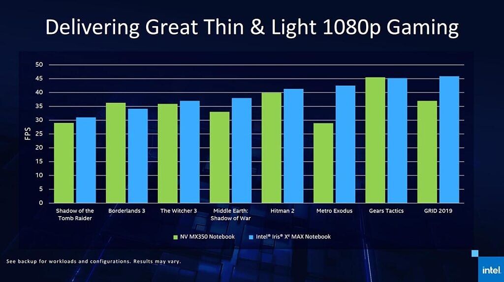
Intel says that the CPU is rarely optimized in thin-and-light laptops paired with third-party discrete graphics. Deep Link’s Dynamic Power Share will enable all the power and thermal resources to be dedicated to the CPU when the discrete GPU is idle, thereby resulting in up to 20% better CPU performance during a sustained task like executing a final render. The new Iris Xe MAX graphics will also deliver improved 1080p gaming on popular games. For gamers, Intel is also adding two new features- Game Sharpening and Instant Game Tuning. These features will be available through the Intel Graphics Command Center. You can check out the performance numbers below:

intel iris xe max gpu performance numbers

Paired with the new 11th-Gen Intel Core mobile processors, the new Intel Iris Xe MAX graphics is claimed to deliver Additive AI to provide up to 7-times faster AI-based creation compared to similar laptops configured with third-party graphics. For this Intel used its 11th-Gen Intel Core i7-1165G7 with Intel Iris XeMAX against a 10th-Gen Intel Core i7-1065G7 with Nvidia GeForce MX350. It will also offer Hyper Encode for up to1.78-times faster encoding than a high-end desktop graphics card. For this, the company used the same combo against the 10th-Gen Intel Core i9-10980HK with Nvidia GeForce RTX 2080 Super Max-Q.

intel iris xe max gpu specifications

The all-new Iris Xe MAX graphics along with the newest 11th-Gen Intel Core Mobile processors will be available starting today. The Acer Swift 3x, Asus VivoBook Flip TP470, and Dell Inspiron 15 7000 2-in-1 will be the first three devices featuring the new hardware. Furthermore, Intel plans to launch entry-level discrete to high-end gaming and data center graphics for HPC and AI workloads. It is also working with partners to bring Xe-LP-based discrete graphics for affordable desktops in the first half of 2021. Additionally, the Xe-LP based Intel Server GPU will be shipping this year while the Xe-HP and Xe-HPG products are scheduled to arrive next year.

Intel shares architecture details on the 11th-gen Rocket Lake CPU range

The post Intel Iris Xe MAX is the company’s first discrete GPU for laptops appeared first on xda-developers.


from xda-developers https://ift.tt/31XuRUU
via IFTTT

Five reasons XDA loves LineageOS

LineageOS is one of the most popular custom ROMs available for Android devices, if not the most popular custom ROM out there. Evolving from the halcyon days of the CyanogenMod project, LineageOS is now known for being a lightweight ROM with the bare minimum in additional features resulting in a high-performance, high versatility Android variant. But why do people love it so much? Here are five of our biggest reasons.

1. It extends your phone’s lifespan

First and foremost, we love LineageOS because it lets you extend the life of your phone. Not every Android smartphone is eligible to get 3 years of OS and security updates from their makers, but that doesn’t mean you have to abandon your perfectly good $1000 phone after the official support ends. By flashing LineageOS on one of the hundreds of officially supported devices, you can breathe new life into your old phone – saving the planet, and your pocket. Moreover, third-party developers frequently use its open-source codebase as the foundation for porting newer versions of Android to legacy devices, replacing their otherwise out-of-date (and insecure) firmware.

2. It’s stable and secure

LineageOS 17.1 Trust menu showing SELinux, security patch, encryption status

Unlike typical homebrew software, official LineageOS builds are standardized against a Device Support Requirements charter. It ensures that all the basic hardware functionalities (such as Wi-Fi, Bluetooth, GPS, Camera, NFC, etc.) continue to operate after replacing the factory-installed software with LineageOS. Even if the OEMs stop updating the closed source vendor components, LineageOS maintainers continue to merge the latest patches to the Linux kernel corresponding to the device with each monthly Android Security Bulletin. To set the seal on security, SELinux is always set to enforcing on official variants. When you download and install a LineageOS build from lineageos.org, you know it’s been cryptographically signed by their build server, and not by anyone else, which further ensures that any one developer isn’t tampering with builds.

3. It’s a great way to de-Google your device

LineageOS 17.1 preinstalled apps

Some people love Android but don’t always feel comfortable with how closely tied it is to Google. LineageOS offers a great way to have the best of both worlds. By default, Google Apps aren’t included in LineageOS ROMs – but they can be installed in a streamlined and simplified way by flashing a suitable GApps package. You can even enjoy most of the Google services without the proprietary software components from the Mountain View giant by flashing a special forked version of LineageOS. It’s about freedom of choice.

4. It’s darn close to Stock AOSP Android


One of the most common complaints from Android users comes when a handset maker fiddles about too much with vanilla Android. We’ve come a long way from the likes of the Sony X10, which rewrote so much Android code that many standard modifications could brick it, but there’s still a glut of devices with alternative launchers, crippled options, and privacy hindering bloatware, replacing stock apps. There’s none of that with LineageOS. Sure, it has its own stock apps, but there’s nothing unnecessary, and more importantly – nothing is taken away. It’s pure Android loveliness, your way.

5. It’s got loads of exclusive features

LineageOS Permissions Hub under Privacy

Just because it’s a near-stock experience doesn’t mean that LineageOS hasn’t got a lot of exclusive features too. When building a ROM, it’s very tempting to throw the kitchen sink at it. The problem is, that can often affect the stability of the device. LineageOS strikes the right balance between great innovations like a dedicated Permissions Hub and a highly functional theming engine (based on the ThemePicker app from AOSP), without compromising the overall speed and stability of the phone – giving you advanced security, more customization options, and extra features, with the stability of a box-fresh phone. Oh yes, and did we mention? It’s incredibly easy to obtain superuser access, even though LineageOS doesn’t ship with a pre-installed root binary.

Find out more about LineageOS on the official website.

Or if you’re already sold, maybe you’d like to be amongst the first to own our XDA phone – the F(x)tec Pro1-X, which runs LineageOS out of the box. Find out more here.

With inputs from Skanda Hazarika

The post Five reasons XDA loves LineageOS appeared first on xda-developers.


from xda-developers https://ift.tt/34HyvUo
via IFTTT

The Moto G 5G could be Motorola’s next budget 5G phone with Qualcomm’s Snapdragon 750G

The newly announced Qualcomm Snapdragon 750G could be the system-on-chip selected to power the upcoming Moto G 5G, XDA has learned, alongside other specifications. Furthermore, a live device photo has also surfaced on Slashleaks, showing off the display and the camera cutout on the front. The Moto G 5G Plus launched in July of this year.

Motorola Moto G 5G front panel on the home screen

Moto G 5G reported specifications

The Motorola Moto G 5G is said to feature a 60Hz. 6.66-inch 2400×1080 display. We don’t know if it’s an AMOLED or LCD panel yet, and a camera cut-out is present in the middle of the status bar. It will likely have 6GB of RAM and 128GB of storage, along with a 5,000 mAh battery too.

As for the camera setup, the Moto G 5G reportedly features 3 cameras on the back and 1 singular selfie camera. The three cameras reported are the following.

  • Samsung GM1 48MP primary sensor
  • Samsung S5K4H7 8MP telephoto
  • OmniVision OV02B10 2MP macro

The single selfie camera is the OmniVision OV16A1Q, which shoots at 16MP but uses pixel binning to create a 4MP image.

However, the more interesting news about the Motorola Moto G 5G is that it seemingly packs a dedicated Google Assistant button. This is a pretty self-explanatory button, as it will allow you to easily and quickly access the Google Assistant. It is also expected to come to Verizon in the US, though it will not have the Google Assistant button in tow. The Plus variant of this smartphone packs a Google Assistant button as well.

Finally, the Moto G 5G will have SD card support and an NFC reader. The model numbers for this particular smartphone are as follows:

  • XT2113-1
  • XT2113-2
  • XT2113-3
  • XT2113-5

The Moto G 5G was first reported by TechnikNews as having the codename “Kiev”. This is one of the first smartphones to pack a Snapdragon 750G, with both Xiaomi and Samsung being the only two OEMs to have confirmed launches.


Image source: Slashleaks

The post The Moto G 5G could be Motorola’s next budget 5G phone with Qualcomm’s Snapdragon 750G appeared first on xda-developers.


from xda-developers https://ift.tt/2TGz8ri
via IFTTT

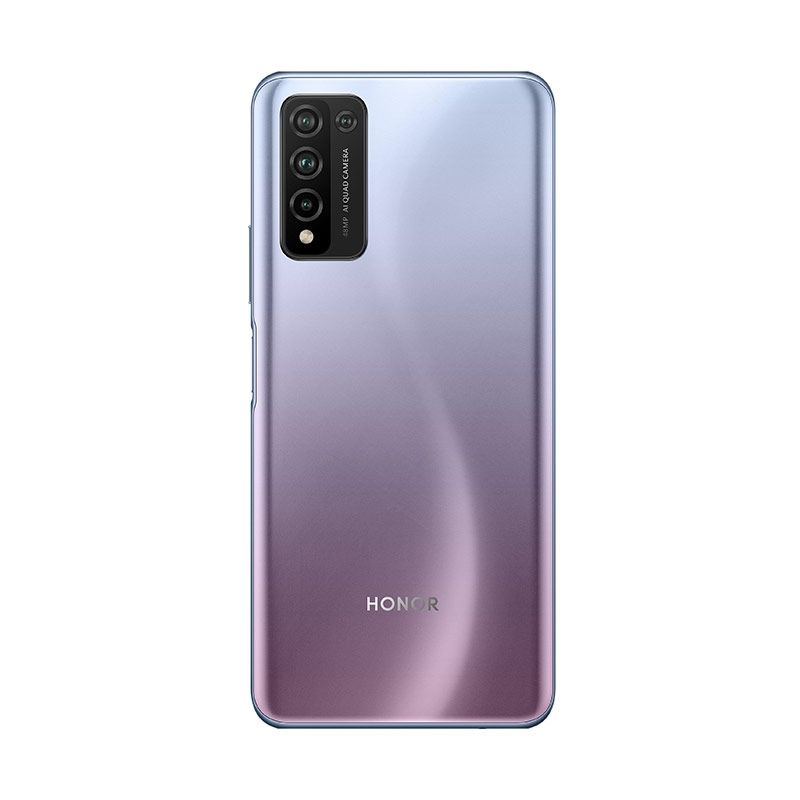
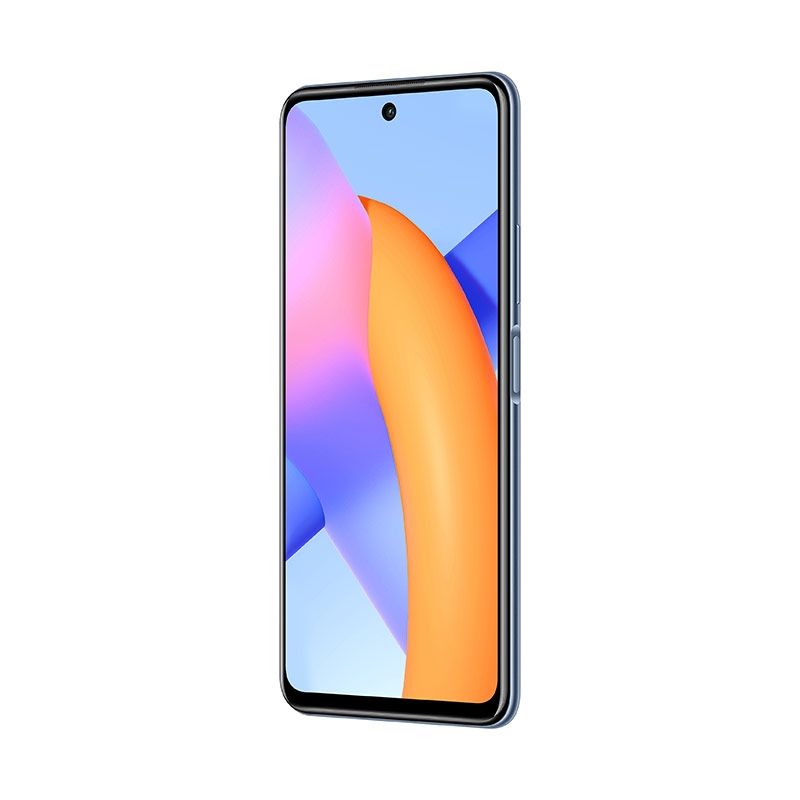
Honor 10X Lite is a new mid-range smartphone coming to Saudi Arabia, Europe, and Russia

Honor, the millennial sub-brand of Huawei has announced the Honor 10X Lite, launching in Saudi Arabia with a wider European rollout expected. The lower mid-range handset comes at a knockdown price, but of course, won’t come with Google Mobile Services (GMS) out-of-the-box. It’s a more affordable version of the Honor 10X and 10X Max phablet, launched during the summer, but unlike them, doesn’t offer 5G connectivity.

The Honor 10X Lite offers a reasonable, if slightly pedestrian, set of specs that are reasonably on par at this price point. The fly in the ointment is, as ever, the lack of Google apps, because of the current sanctions against parent company Huawei. But if that doesn’t put you off (they can be sideloaded), there’s a Kirin 710 octa-core SoC backed up by 4GB or RAM and 128GB of storage, expandable with microSD by up to 256GB.

The camera is a 48MP quad-lens, flanked by a 5MP ultrawide sensor, with a 2MP for depth and 2MP for macro. Round the front, there’s an 8MP punch-hole selfie camera. The display is a 6.67-inch FHD+ IPS LCD, but at this price, we wouldn’t expect AMOLED. There’s a fingerprint sensor on the side of the device, an increasingly common location for security, and Android 10, wrapped in Honor’s Magic UI 3.1 skin.

Connectivity is pretty standard fayre at this level – LTE (no 5G), Wifi ac (no Wifi6), Bluetooth 5.1, NFC, and A-GPS. There is a headphone jack and USB-C 2.0. The generous 5000mAh battery allows for Honor Supercharge, which the manufacturer claims is capable of charging to 46% in 30 minutes.  All in all – a competent but uninspiring choice and with so many other phones competing in this space, the lack of Google apps will make this a difficult sell for many.

The Honor 10X Lite is available in three color variants – Icelandic Frost, Midnight Black, Emerald Green. It’s on sale now in Saudi Arabia priced at SAR799 ($213) and due to arrive in Russia on November 6th with a European release shortly afterward.

Specification Honor 10X Lite
Build Icelandic Frost, Midnight Black, Emerald Green
Dimensions & Weight
  • 76.88 x 165.65 x 9.2mm
  • 206g
Display
  • 6.67″ hole-punch IPS LCD
  • FHD+ 2400 x 1080
SoC Kirin 710
RAM & Storage
  • 4GB RAM
  • 128GB internal storage
  • Storage expandable via microSD up to 256GB
Battery & Charging 5000mAh with 22.5W fast charging
Security Side-mounted fingerprint sensor
Rear Camera(s)
  • 48MP
  • 5MP ultrawide
  • 2MP depth
  • 2MP macro
Front Camera(s) 8MP
Port(s) USB-C
Audio 3.5mm audio jack
Connectivity LTE/Wi-Fi 5/Bluetooth
Software Honor Magic UI 3.1 on Android 10 with HMS (no GMS)
Other Features Game Acceleration e-reader mode

The post Honor 10X Lite is a new mid-range smartphone coming to Saudi Arabia, Europe, and Russia appeared first on xda-developers.


from xda-developers https://ift.tt/37YucGA
via IFTTT

vendredi 30 octobre 2020

Telegram’s latest update allows multiple pinned messages, distance alerts on live locations, and more

Messaging app Telegram has announced a new raft of features for Android users, including some that you’re unlikely to find in other messenger apps. It’s the second tranch of updates to Telegram in the past few months, as the battle between competing platforms continues.

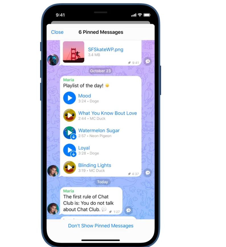
The Pinned Messages feature now lets you pin a number of threads — great for multitasking between different people where you want to keep conversations separate, or perhaps you’re talking with the same person about several different things at the same time. To use it, you can either tap the top bar to cycle through the threads or use the newly added button to move them all to their own page. This is the first time that pinning has applied to one-to-one conversations, as well as group chats.


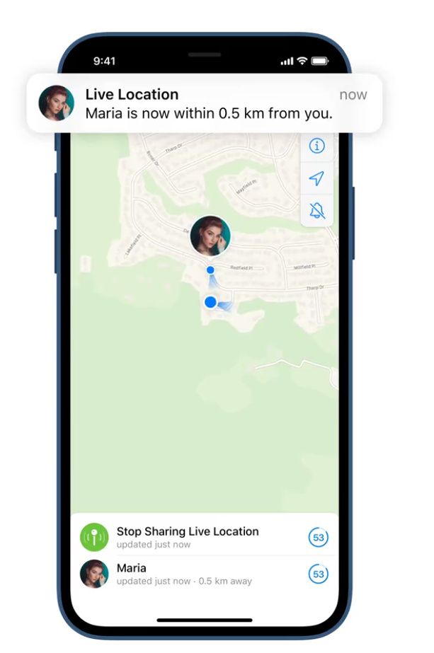
Also new, where users are sharing their live location with you, you can set an alert to tell you when they’re nearby. Additionally, the map will now show what direction you’re going in, so you can guide them in to meet you more easily. If that wasn’t enough, when you send multiple songs over Telegram, the receiver now gets sent a playlist. When you start playing one, the entire playlist will be added to a queue in Telegram’s built-in media player. You can choose to separate each song from the playlist if you prefer, but there’s no doubt this is a much tidier way of doing it.

Telegram Pinned Groups Telegram Find Friend Telegram Stats

Finally, there are new analytics tools for your shared posts. You can view data for the whole channel, or for individual posts. You can even see where your post has been forwarded into public channels. There are some fancy new animations and emojis to choose from, plus you can now annotate a photograph from someone you’re chatting to in-line, without downloading it and reuploading it.

All these features are available now by updating your Telegram app in the Play Store. As Telegram notes, “If you’re on iOS, you’ll get the update as soon as either a) Apple finishes reviewing it OR b) you decide it’s time to switch to Android.”

Well, we didn’t like to say, but….

Telegram (Free, Google Play) →

The post Telegram’s latest update allows multiple pinned messages, distance alerts on live locations, and more appeared first on xda-developers.


from xda-developers https://ift.tt/2JeThCy
via IFTTT

Samsung Galaxy Store gets a big redesign with an emphasis on games

Samsung has introduced a redesign to its Galaxy Store, and now there are only two tabs: one for apps and one for games. Unsurprisingly, the title prominently featured in the section for games is Fortnite, which was previously pulled from the Play Store and Apple’s App Store.

“Right now, Galaxy Store is the only mobile app store in the United States where you can download the hit title from Epic Games, Fortnite, and squad up with friends,” Samsung said in a blog post.

As part of the redesign, the bottom bar has been reduced to two sections for app and games, with the games section placed ahead of apps. Other sections, like the one for viewing Galaxy Watch apps, has been moved to a scrolling bar at the top; the same bar also offers quick access to exclusives and personalization.

Samsung Galaxy Store redesign

Samsung is also pushing users to take advantage of Galaxy-exclusive rewards and benefits. If you buy a game from the Galaxy Store, for example, you’ll earn rewards points that you can put toward another purchase in the future.

In its blog post, Samsung reminds users that they can access Xbox Game Pass Ultimate through its Galaxy Store as well. While users can access Microsoft’s service through Google’s Play Store, only users of the Galaxy Store can enjoy the convenience of in-app purchase capabilities.

Samsung’s Galaxy Store has always been a decent alternative to Google’s Play Store, offering some exclusive apps for Galaxy owners. Touting its store as the only mobile app store in the U.S. where you can find Fortnite is a pretty big deal, especially considering the game will likely stay off the Play Store at least until the beginning of next year, when Epic Games and Google are expected to go to trial.

If you own a Galaxy device, you should be able to see the redesigned Galaxy Store starting today.

    Samsung Galaxy S20 5G
    What better way to access the Galaxy Store and play Fortnite than with a Samsung Galaxy S20 5G? This is one of Samsung's most well-rounded devices and a great way to enjoy mobile gaming.

The post Samsung Galaxy Store gets a big redesign with an emphasis on games appeared first on xda-developers.


from xda-developers https://ift.tt/31Uxerd
via IFTTT

Apple One services bundle now available, starts at $14.95 a month

Following an announcement in September, Apple has launched Apple One, which bundles together its many services for a low monthly price. There are three different plans: Individual, Family and Premier, the latter of which offers everything in Apple’s portfolio, from Apple Music to the company’s upcoming Fitness Plus service.

The Apple One individual plan is available for $14.95 a month and features Apple Music, Apple TV Plus, Apple Arcade and 50GB of iCloud storage. The Family plan features the same services but ups the storage to 200GB, and can be shared with five other people for $19.95 a month. Finally, there’s a $29.95 Premier plan, which adds Apple News Plus, ups iCloud storage to 2TB, and includes Apple Fitness Plus.

Apple One prices

Fitness Plus is Apple’s new personalized fitness platform that offers a variety of workouts and deep Apple Watch integration. Unfortunately, Fitness Plus isn’t available just yet despite the launch of Apple One, so Premier plan subscribers won’t get their money’s worth until the service launches later this year. If you decide not to subscribe to a Premier plan but want Fitness Plus, it will cost $9.99 on its own.

You have to consider your needs before subscribing to an Apple One plan, but if you already had plans to subscribe to all of Apple’s services individually, you’re going to save some money. The Individual plan saves $6 a month; the Family plan saves $8 a month; and the Premier plan saves $25 a month.

You can currently subscribe to Apple One through your iOS device. Launch Settings and click on your Apple ID, then tap Subscriptions and you’ll see an option to subscribe. Apple is offering a one-month free trial, after which account holders will be billed on a monthly basis. Individual and Family plans are available in over 100 countries, while Premier is available in the U.S., UK, Australia, and Canada.

The post Apple One services bundle now available, starts at $14.95 a month appeared first on xda-developers.


from xda-developers https://ift.tt/2HOUYq5
via IFTTT

Gmail for Android prepares to add Search Chips for filtering Chat messages

Google introduced a new feature in Gmail called “Search Chips” earlier this year in February. The feature added clickable search suggestions in Gmail for G Suite users, making search filters a whole lot easier to use. A couple of months after the initial release, Google rolled out Search Chips in Gmail for consumers. While the company has yet to add the feature in the mobile version of Gmail, they are bringing a similar search filtering feature for users of Chat.

An APK teardown can often predict features that may arrive in a future update of an application, but it is possible that any of the features we mention here may not make it in a future release. This is because these features are currently unimplemented in the live build and may be pulled at any time by the developers in a future build.

A teardown of the Gmail app for Android (v. 2020.10.04) has unearthed new strings of code that hint at the upcoming search filters for Chat messages. Entering any keyword in the search bar will bring up related Search Chips right underneath the Search bar. Tapping on the Search Chips will instantly apply a filter and display all related messages underneath.

<string name="search_filtering_attachment_chip_title_with_count">Attachment+%d</string>
<string name="search_filtering_author_chip_title">From</string>
<string name="search_filtering_author_chip_title_with_name">From %s</string>
<string name="search_filtering_author_chip_title_with_name_and_count">From %1$s+%2$d</string>
<string name="search_filtering_dialog_attachment_icon_content_description">Attachment icon</string>
<string name="search_filtering_documents_chip_title">Documents</string>
<string name="search_filtering_documents_chip_title_with_count">Documents+%d</string>
<string name="search_filtering_images_chip_title">Images</string>
<string name="search_filtering_images_chip_title_with_count">Images+%d</string>
<string name="search_filtering_pdf_chip_title">PDFs</string>
<string name="search_filtering_pdf_chip_title_with_count">PDF+%d</string>
<string name="search_filtering_people_suggestion_header_title">Suggested</string>
<string name="search_filtering_sheets_chip_title">Sheets</string>
<string name="search_filtering_sheets_chip_title_with_count">Sheets+%d</string>
<string name="search_filtering_slides_chip_title">Slides</string>
<string name="search_filtering_slides_chip_title_with_count">Slides+%d</string>
<string name="search_filtering_video_chip_title">Videos</string>
<string name="search_filtering_video_chip_title_with_count">Video+%d</string>

As you can see in the below screenshot from Android developer and reverse engineer Alessandro Paluzzi, there are a couple of filter suggestions, including an author and attachment. Clicking on these suggestions will narrow down your search, which is a significantly easier process than typing out Gmail’s old filters.

As of now, we have no information from Google regarding Search Chips integration in Gmail for mobile. We’ll update this post as soon as the feature goes live in a future version of Gmail for Android.

This article was updated at 1:43 PM EST on October 30, 2020, to reflect that these search filters are intended for filtering Chat messages and not emails.

The post Gmail for Android prepares to add Search Chips for filtering Chat messages appeared first on xda-developers.


from xda-developers https://ift.tt/3mrsoK5
via IFTTT

How OPPO‘s ColorOS 11 Pushes the Trend of Android Customization

OPPO has a strong selection of Android devices in 2020, and with them, OPPO has always had a big focus on software. Android 11 is the latest big release for Google’s mobile operating system. To take full advantage of Android 11, OPPO released ColorOS 11 as one of the most significant updates for ColorOS to date. On September 14th, the ColorOS 11 event took place as a virtual launch. This event gave us a look at all of the new features that would be coming to many OPPO devices. There were many different types of feature updates, but the most interesting aspect was the new customization features.

When I hear about OEM customization on Android, I think about bloated theme engines that slow down my phone without offering much of anything else. This seems to be what ColorOS 11 is trying to avoid. Instead of having a heavily themed interface, they seem to be aiming for a more stock Android look, while implementing effective personalization features.


Trends in OEM Android Software

I ran a poll on the @xdadevelopers twitter account, asking our users what they value in OEM software. Some of the biggest trends from OS software this year have been security, privacy, and customization. All of these features are important, but XDA users ended up valuing personalization more.

XDA Twitter Poll

However, you might notice that the most popular feature was a stock Android experience. So an ideal solution is to make an OS that is closer to stock Android while having some personalization features to make it your own. So how is this done? I’ll share some examples of ColorOS 11 running on an OPPO Find X2 Pro.

The homescreen of this phone will look very familiar to you because it closely resembles what you’d find on a stock Android device. The material design rules from Google are implemented throughout this software. Everything behaves and performs the way you’d expect it to, from a stock Google phone. There are no bloated elements here. Transitions are simples, icons are stock, the settings menu has the traditional layout, and the notification shade isn’t bogged down with OEM features.

All of these features are ready to be customized to your liking. You can tweak the icons, generate your own wallpapers, make ringtones, and more. There’s no need to download icon packs or heavy themes to achieve this look. You can now use the adaptive personalization features to do this. Some of the best new customization features include:

  • Always on Display
  • Home screen icon style
  • Fingerprint icon animation
  • Accent color
  • Font & display size
  • Notification drawer icon shape
  • Edge lighting
  • Dark mode
  • Wallpaper creation

Now users can have their stock Android experience while being able to enjoy some great customization features. This seems to be the best way forward as OEMs are trying to implement more of what users want to see in their next OS update.


The Future of Personalization on Android

Here at XDA, there has always been a large community around Android themes and custom ROMs. However, this has always required a level of technical knowledge that doesn’t reach the general consumer. It’s also a lot of effort that goes into customizing your phone in this way. This is why we are seeing the trend of users valuing personalization features more, as the above poll shows.

Many phone manufacturers are headed in the same direction with these types of features. Implementing them in the right way is key, to avoid becoming clutter, rather than a feature.

Read about all of the new ColorOS 11 Features is our article here:
ColorOS 11 Review – OPPO adds lots of customization over Android 11

We thank OPPO for sponsoring this post. Our sponsors help us pay for the many costs associated with running XDA, including server costs, full time developers, news writers, and much more. While you might see sponsored content (which will always be labeled as such) alongside Portal content, the Portal team is in no way responsible for these posts. Sponsored content, advertising and XDA Depot are managed by a separate team entirely. XDA will never compromise its journalistic integrity by accepting money to write favorably about a company, or alter our opinions or views in any way. Our opinion cannot be bought.

The post How OPPO‘s ColorOS 11 Pushes the Trend of Android Customization appeared first on xda-developers.


from xda-developers https://ift.tt/3ivf9FW
via IFTTT

OPPO Find X2 Pro Display Review: Hardware Excellence

Released in the first half of the wild ride known as the year of 2020, OPPO created an ultra-premium smartphone touted with a display that the industry could not ignore. The OPPO Find X2 Pro is one of the first of its kind, sporting a 120 Hz OLED display at a true WQHD+ screen resolution. It is also one of the first to bring video motion interpolation and SDR-to-HDR video upscaling to the smartphone feature set, which OPPO calls their O1 Ultra Vision Engine. And of course, a highlight on “industry-leading color accuracy,” which is the first time OPPO has made this claim for one of their phones.

OPPO Find X2 Pro – Display Review Highlights

  • Excellent peak brightness
  • Excellent color accuracy in Gentle profile
  • Smooth 120 Hz display
  • Excellent viewing angles and panel uniformity
  • Picture contrast significantly varies with brightness in Vivid mode
  • Irregularities in tint and lightness of shadows at lower brightness
  • HDR content not optimized for the panel’s peak brightness
  • O1 Ultra Vision features are unreliable

OPPO uses a top-shelf Samsung OLED for the Find X2 Pro. Its panel has Samsung’s newest emitter material that can reach higher peak brightness and with overall higher power efficiency than previous generations. The OLED is built on top of a flexible substrate with extremely thin materials up to cover glass, bringing the pixels as close to your fingers as possible. Polarization is excellent with very little color shift at an angle concerning both color and luminance.

This is a display panel that is near-impossible to make look bad. However, one nitpick I have (and always will have) is that OPPO does curve the edges of the display outwards, adding distortion to the edges of content regardless of viewing angle. This is one of the few cases where letterboxing is desirable so that the main content isn’t visible along the problem curve of the display.

Software Display Features

The O1 Ultra Vision Engine is what OPPO calls its two headlining display-related features, which consists of video motion interpolation (up to 60 or 120 FPS) and SDR-to-HDR video upscaling. These two features are said to be supported in most of the popular streaming apps like YouTube and Netflix, although I have only really been successful in getting it to work with Amazon Prime Video for SDR videos. Additionally, the features only work during fullscreen playback, so they’re not effective for videos playing in a feed or for Android’s picture-in-picture mode. Video interpolation up to 120 FPS will also limit the screen render resolution to 1080p.

My impressions of the two features are disappointing. Throughout my testing of the features, their activation seemed too restricted and unreliable. As I mentioned, I couldn’t get it to work at all for any number of Netflix titles, and it would only work sometimes in YouTube. Neither feature works for local content played back in the native gallery app, nor in VLC or Google Photos. Though when it did work, video motion interpolation seemed to do a good job smoothing out motion without introducing unwatchable artifacts. Video Motion Enhancement does cause the soap opera effect so it is not for everyone, and I always recommend leaving this feature disabled on any TV when watching films. HDR Video Enhancement, on the other hand, either never activated for any of the content that I watched, or it was just too subtle to notice.

Another display feature that has been added in is automatic white balance adjustments, which OPPO calls Natural Tone Display. Most people will know this feature better as Apple’s True Tone, which adjusts the screen color temperature according to the color temperature of the surrounding light. I consider this feature to be essential in improving the appearance of a display, so I’m happy to see it in the OPPO Find X2 Pro. Two color-reading ambient light sensors are active on the OPPO Find X2 Pro, one on the front and one on the back, to measure the surrounding light. I’ve found that OPPO’s implementation does a wonderful job of adapting the screen to the ambient lighting, and for some users, it could eliminate the need for a blue light filter by how it tints the screen warmer in lower lighting. One caveat is that enabling this feature disables the screen color temperature adjustment slider, which shouldn’t be necessary since both features are simple color matrix transforms. OPPO should have built these two features to work with one another, with the adjustment slider acting as a bias for the automatic adjustment.

DC Dimming is also present in the OPPO Find X2 Pro, which can help users who are sensitive to display flicker at low brightness. In simple terms, many displays, including almost all OLEDs on smartphones, adjust the screen’s brightness by rapidly switching the display current “off” and “on” over a very fast interval, and some users can notice this flickering at low brightness. The DC Dimming feature instead modulates the brightness of the display by directly adjusting the amplitude of the current being delivered to the display, which defeats the flickering.

OPPO collaborated with a company called Pixelworks, which specializes in video and image processing, for these features. Inside the OPPO Find X2 Pro is Pixelworks’ visual processor, the X5 (formerly called Iris 5), which handles the HDR upscaling and the motion processing. We have published a separate article that covers what else Pixelworks and its X5 chip can do. For the OPPO Find X2 Pro in particular, Pixelworks is also responsible for factory display color calibration and the DC Dimming feature (known as Low-Brightness Flicker-Free Eye Care in the Display settings).

Color profiles

The OPPO Find X2 Pro provides three different color profiles to select from, which changes the color characteristics of the screen.

The Vivid profile is the default profile, which increases color saturation and contrast with a cooler white balance than standard. The profile uses P3 primaries for the default color space, and the correlated color temperature of the default white point is about 7300 K, adjustable by a color temperature slider. Reds have up to a 20% increase in saturation, and they are tinted towards a deeper red. Greens have up to 32% boost, with hues remaining roughly on track with sRGB. The profile’s blues share the same primary with sRGB, but slightly brighter, appearing up to 3% more saturated (an increase in colorfulness to be exact). The contrast of the profile is standard but uncontrolled, initially targeting a gamma power of 2.20 at low brightness but increasing in contrast as display brightness increases.

The Gentle profile is the color-accurate profile, which targets the sRGB color space with a D65 white point (actually measuring to about 6300 K), and also employs color management up to P3 for apps and content that support it. Screen color temperature is also adjustable, which is useful for those that want relatively accurate colors but with a cooler white point. The profile targets a gamma power of 2.20 regardless of display brightness, unlike the Vivid profile.

The Cinematic profile is similar to the Gentle profile, but it targets the P3 color space instead of sRGB, which is useful when viewing P3 content in an app that doesn’t support color management. It needs to be mentioned that this profile is only accurate for content that is explicitly graded in the P3 color space and not for the vast majority of colors you see on your homescreen, apps, or websites.

Methodology for gathering data

To obtain quantitative color data from the display, I stage device-specific input test patterns to the OPPO Find X2 Pro and measure the display’s resulting emission using an X-Rite i1Display Pro metered by an X-Rite i1Pro 2 spectrophotometer in its high-resolution 3.3nm mode. The test patterns and device settings I use are corrected for various display characteristics and potential software implementations that may alter my desired measurements. My measurements are typically done with display-related options disabled unless mentioned otherwise.

I use constant power patterns (sometimes called equal energy patterns), correlating to an average pixel level of about 42%, to measure the transfer function and grayscale precision. It’s important to measure emissive displays not just with constant average pixel level, but with constant power patterns since their output is dependent on the average display luminance. Additionally, a constant average pixel level does not inherently mean constant power; the patterns I use satisfy both. I use a higher average pixel level closer to 50% to capture a midpoint between both the lower pixel levels and the many apps and webpages with white backgrounds that are higher in pixel level.

I use the latest color difference metric ΔETP (ITU-R BT.2124), which is an overall better measure for color differences than ΔE00 that is used in my earlier reviews and is still currently being used in many other sites’ display reviews. Those that are still using ΔE00 for color error reporting are encouraged to use ΔEITP.

ΔEITP normally considers luminance (intensity) error in its computation, since luminance is a necessary component to completely describe color. However, since the human visual system interprets chromaticity and luminance separately, I hold our test patterns at a constant luminance and do not include the luminance (I/intensity) error in our ΔEITP values. Furthermore, it is helpful to separate the two errors when assessing a display’s performance because, just like with our visual system, they pertain to different issues with the display. This way, we can more thoroughly analyze and understand the performance of a display.

Our color targets are based on the ITP color space, which is more perceptually-uniform than the CIE 1976 UCS with much better hue-linearity. Our targets are spaced out roughly even throughout the ITP color space at a reference 100 cd/m2 white level, and colors at 100%, 75%, 50%, and 25% saturation. Colors are measured at 73% stimulus, which corresponds to about 50% magnitude in luminance assuming a gamma power of 2.20.

Contrast, grayscale, and color accuracy are tested throughout the display’s brightness range. The brightness increments are spaced evenly between the maximum and minimum display brightness in PQ-space. Charts and graphs are also plotted in PQ-space (if applicable) for proper representation of the actual perception of brightness.

ΔETP values are roughly 3× the magnitude of ΔE00 values for the same color. The metric assumes the most critically-adapted viewing condition for the observer, and a measured ΔETP color difference value of 1.0 denotes a just-noticeable-difference for the color, and a value less than 1.0 signifies that the measured color is indistinguishable from perfect. For our reviews, a ΔETP value of less than 3.0 is an acceptable level of accuracy for a reference display (suggested from ITU-R BT.2124 Annex 4.2), and a ΔETP value greater than 8.0 is noticeable at a glance (tested empirically, and the value (8.0) also nicely lines up with roughly a 10% change in magnitude for luminance, which is generally percentage needed to notice a difference in brightness at a glance).

HDR test patterns are tested against ITU-R BT.2100 using the Perceptual Quantizer (ST 2084). HDR sRGB and P3 patterns are spaced out evenly with sRGB/P3 primaries, an HDR reference level white of 203 cd/m2 (ITU-R BT.2408), and a PQ signal level of 58% for all its patterns. All HDR patterns are tested at an HDR-average 20% APL with constant power test patterns.

Brightness

The OPPO Find X2 Pro’s display is among the brightest on the market, only being beat by the Samsung Galaxy Note 20 Ultra. However, just like every other OLED, its brightness varies depending on the color profile being used and the current power consumption of the display (which depends on the intensity of the lit pixels being displayed, usually called ADL, or average display luminance). The latter isn’t much of an issue when using the Gentle or Cinematic color profiles since they attempt to keep the display brightness consistent independent of what the screen is outputting, although it still isn’t perfect.

At 100% ADL, which is a full screen of pure white emission and the state of highest power draw for an OLED display, the OPPO Find X2 Pro peaks at about 746 nits, which is excellent. This is characteristic of Samsung’s best OLED panels in 2019, although Samsung has made another leap forward in 2020 with the Galaxy Note 20 Ultra, peaking close to 1,000 nits at 100% ADL. Regardless, the OPPO Find X2 Pro’s output is nothing to scoff at.

At lower ADLs, the different characteristics of the two profiles (Vivid vs. Gentle/Cinematic) become more obvious. The Gentle/Cinematic profiles slightly decrease in brightness as ADL decreases, while the Vivid profile ramps brightness up, redirecting available display power at lower pixel levels. In other words, the Vivid profile aims to make whites as bright as possible, while Gentle/Cinematic keeps color tones balanced and legible. At 50% ADL, which is a good middle value between light-themed and dark-themed apps and websites, Vivid mode averages a 920-nit white point while Gentle/Cinematic averages 700 nits. The difference becomes even more stark at 20% ADL, with Vivid emitting about 1,090-nit whites and Gentle only mustering 680 nits. However, there’s more to content legibility than the peak output of white, which I cover next.

Contrast and Tone Mapping

As I mentioned previously, there’s a significant difference in the brightness of peak white between the Vivid and the Gentle/Cinematic color profiles, so what’s the deal? Peak brightness on OLED panels is always a matter of compromise, and the two profiles clearly have different approaches to rendering content.

OPPO Find X2 Pro tone mapping gentle profile OPPO Find X2 Pro tone mapping vivid profile

Tone mapping for OPPO Find X2 Pro
42% APL ≈ 20% ADL

We see here that the Vivid profile makes sacrifices to reach such a high peak brightness at lower pixel levels. Near max brightness, the Vivid profile severely undertracks our target 2.20 gamma power, and it actually renders colors darker than the Gentle profile below 60% color intensity. This behavior for the Vivid profile carries on even with higher pixel levels. Therefore, while the Vivid profile can render much brighter whites, it will render mid-tones and shadows much darker, skewing the appearance of photos and videos.

We also have to realize that this brightness level will only be active during high ambient brightness, so we need to consider how that would affect screen contrast. An advantage of this tone mapping behavior is an improvement in the contrast of light text on a dark background, but generally, you would want the opposite in bright ambient lighting. However, dark text on a white background would result in a high on-screen APL/ADL, decreasing the peak brightness and eliminating the advantage of the profile’s tone map characteristic. Bright ambient lighting also suppresses the contrast of displays by increasing the black point, which can be compensated for by increasing the lightness of colors. Instead, the Vivid profile darkens them, further deteriorating the appearance of content on the screen. From this behavior, I conclude that the Vivid profile would benefit from employing the same type of brightness compensation and tone map control as the Gentle profile to maintain the same level of contrast throughout its brightness range. However, the reduction in peak brightness wouldn’t look as good on a spec sheet.

OPPO Find X2 Pro contrast gentle profile OPPO Find X2 Pro contrast vivid profile

Contrast for OPPO Find X2 Pro
42% APL ≈ 20% ADL

We have a better depiction of the perceptual contrast and the display’s variation when viewing the tone mapping with PQ-scaled and normalized axes (PQ stands for Perceptual Quantizer, which is currently our best function to map the magnitude of luminance linearly to the stimulus of perceived brightness of the human eye). It allows me to verify my observations above, and it shows just how drastic the Vivid profile can darken colors.

The Gentle profile, on the other hand, does a good job of accurately reproducing the structure of content. It tracks a gamma power of 2.20 nicely, although it isn’t perfect: There’s some slight crushing of dark colors near 100 nits (~60% PQ brightness), and there’s lifting in the shadows at low brightness near 10 nits, which dissipates at minimum brightness. Furthermore, there are variances in tinting for darker color tones (which we’ll explore in the next section), as well as a slight wash-out in picture contrast when the OPPO Find X2 Pro switches over to the 60 Hz display mode below 50% brightness. At max brightness, it may seem that there is an excess in color lightness of the Gentle profile, but since max brightness should only be viewed in very bright conditions, this behavior is desirable.

White Balance and Grayscale Precision

Generally, anyone can get used to the white balance of a display, but irregularities in its color temperature can be perpetually annoying. This is why it’s important for the color of white on a display to be consistent throughout its brightness (and for those that call out Apple’s True Tone for doing the opposite, it actually helps smooth out the perceived consistency of white through chromatic adaptation). And not just for white, but for any shade of gray (which are just less intense whites), all the way down to black.

OPPO Find X2 Pro grayscale plot vivid 120Hz

Grayscale spread for OPPO Find X2 Pro (Vivid/120 Hz)

The default Vivid profile tends to a colder 7300 K white point, which many people prefer over the warmer 6500 K which is necessary for accurate color. But the important bit here is that the Vivid profile shows a moderate amount of spread in its reproduction of white and gray. The darkest tones are a different tint than the lighter tones at every brightness level, towards either green or magenta. This can mislead some people into thinking that an object in an image, or an app interface element, is purple or green when it’s supposed to be dark gray.

OPPO Find X2 Pro grayscale plots gentle 120Hz

Grayscale spread for OPPO Find X2 Pro (Gentle/120 Hz)

The white point and mid-grays themselves are accurate in the OPPO Find X2 Pro’s Gentle profile, measuring a small color error ΔETP of about 2.0-3.0 across the brightness range. But, like many other OLED panels, the display on the OPPO Find X2 Pro begins to exhibit flaws in color reproduction for very dark color tones, increasing in severity at lower brightness. The variance is less than that of the Vivid profile’s, but the main problem areas in tint are still present. From our Contrast measurements earlier, we saw some notable dips and lifts in the darker colors at low brightness. Those dips and lifts are caused by a non-linearity in the red and green channels at those points: At below 30 nits white level, we see a rising surplus in the green drive for darker colors, causing those colors to appear sickly and washed out. This is clearly visible in our 20% PQ brightness grayscale spread plots, and it shifts the entire average color temperature towards green, resulting in a high average grayscale color error ΔETP of 5.0. This increases in intensity down to about 5 nits, where those color tones begin to tint red-magenta instead. The darkest grays appear cloudy and non-uniform on the OPPO Find X2 Pro’s display, as if the panel is working hard to emit any resemblance of visible light.

Refresh rate color difference
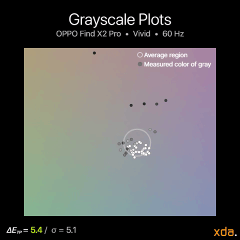
Grayscale difference between 120 Hz and 60 Hz

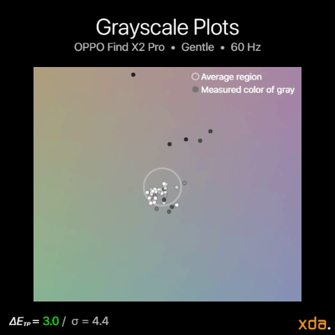
The figures above switch between the 120 Hz plots and the 60 Hz plots for their respective color profiles, which shows the color difference when the OPPO Find X2 Pro switches into its 60 Hz display mode, such as when watching a video. We clearly see that the 60 Hz calibration shows less refinement than the 120 Hz calibrations, with much higher color variance and maximum color drift. The display no longer tints green, but it doubles down on driving towards red-magenta.

While this all may seem like bad news, this OLED performance is actually about par for the course — it performs averagely among all the OLEDs that I’ve used and measured. There is an inherent difficulty in controlling LEDs at very low voltages, which is why the color performance of most OLEDs completely breaks down near minimum brightness. Nevertheless, OEMs should allot more of their display-related efforts into assuring optimal display performance at low brightness, which would significantly improve the user experience at night.

Color Accuracy

My impressions of the OPPO Find X2 Pro’s color accuracy in the Gentle profile were initially great, like with most flagship displays. Smartphone color accuracy at moderate brightness levels has been beyond acceptable in the smartphone world for the past few years. Although, the last display that I’ve found to have a sizable issue in color calibration was the OnePlus 8 Pro with its oversaturated reds (although only for the U.S. variant), which was comparable to the undersaturation in reds found in the Google Pixel 2 XL — just in the other direction. But besides that, color accuracy (which, to be precise, is the tracking of chromaticity; that is, the stimulus of color without lightness) has not been a huge issue for color-calibrated color profiles in smartphones for a while. So, naturally, we gravitate towards nitpicking the last remainder of the blemishes we can find, since that’s what sets them apart nowadays.

OPPO Find X2 Pro color accuracy plot

sRGB color accuracy plots for OPPO Find X2 Pro (Gentle)

Unsurprisingly, the Gentle profile’s sRGB color accuracy at higher brightness is close to what other display reviews may call “perfect”. At 80% to 60% PQ brightness, there’s a slight shift towards green for the white point, which can be slightly noticed in the cyans as well. Issues start becoming more tangible below 40% PQ brightness, where red color mixtures (red, pink, magenta, purple) begin to noticeably compress in saturation, while the bias towards green is still existent, causing reds to appear more orange. Below 10 nits, the OPPO Find X2 Pro looks washed out in both contrast and in saturation, which makes for underwhelming content renditions in nighttime usage.

P3 color accuracy plots for OPPO Find X2 Pro (Gentle)

For the P3 color gamut, which the Gentle profile is capable of rendering for properly color-managed apps and content, the OPPO Find X2 Pro performs about identically to its sRGB rendition, which is decent.

Unfortunately, the Android ecosystem still doesn’t make any real use of the P3 color space. It is generations behind Apple’s in viability and integration; wide color content is prolific in the Apple platform without any user or developer needing to know about explicitly implementing it, while Android has been mostly stuck with sRGB. We’re also padlocked in due to OEMs believing that default color profiles that oversaturate colors are a solution to our constrained color palette. However, there is an uptick of wide-color content that is emerging on both platforms, which comes from the rise of HDR10 and Dolby Vision titles on popular streaming services.

HDR Playback

As usual, the foundation of color reproduction begins with contrast, which, for HDR content, predominantly follows the ST.2084 PQ curve. The OPPO Find X2 Pro touts a local peak brightness of 1200 nits for a small region of the screen, however, it doesn’t seem to employ this in its most applicable area, which is in HDR content. For HDR content, the OPPO Find X2 Pro seems to only peak at about 650 nits for the Vivid profile and 450 nits for the Gentle profile. This is the same peak brightness as found in the profiles’ manual brightness range, so it doesn’t seem like the OS is utilizing its high brightness mode to achieve brighter highlights. The Vivid profile also treats shadows better than the Gentle profile, the latter of which washes them out by rendering them too lightly. It’s possible to force high brightness mode onto HDR content, which allows brighter highlights, but the display completely veers off the ST.2084 curve.

For color accuracy, both profiles have acceptable performance. Neither are reference-level, but the important part is that neither profile produces any colors that are offensively inaccurate. They’re both on-track, with the only difference being that the Vivid profile is slightly more saturated, with slightly brighter highlights. I recommend the Vivid profile overall for better HDR content rendition, even though the Gentle profile is supposed to be the more color-accurate profile.

Conclusion & Summary

The OPPO Find X2 Pro houses a truly premium display panel that will more than satisfy the masses. It has one of the brightest displays, with some of the best viewing angles on a smartphone. It also has one of the only 120 Hz displays that runs at its full WQHD+ resolution. Colors are very vibrant by default, which can be set to be sufficiently accurate for content creation with the Gentle profile.

OPPO Find X2 Pro Forums

However, the display may not satisfy those that are particularly sensitive to color tinting in low light. You should not buy this phone solely for its motion interpolation and HDR video upscaling capabilities, since they don’t appear to work reliably in many apps (including in Netflix, YouTube, and local playback apps), although the features work fine when they do. The OPPO Find X2 Pro is not perfect by any means, but if you’re not righteously against outwardly-curving screens and hole-punch cameras, then it is easy to prescribe its display as one of the best available in 2020.

    OPPO Find X2 Pro
    OPPO's Find X2 Pro features the best display panel and visual processing features the company has ever put on a smartphone. A premium flagship smartphone commands a premium price, though you can get it now for £100 off.
Specification OPPO Find X2 Pro
Type

Flexible OLED

PenTile Diamond Pixel

Manufacturer Samsung Display Co.
Size

6.1 inches by 2.8 inches

6.7-inch diagonal

16.9 square inches

Resolution

3168×1440 (native)

19.8:9 pixel aspect ratio

Pixel Density

363 red subpixels per inch

513 green subpixels per inch

363 blue subpixels per inch

Distance for Pixel Acuity Distances for just-resolvable pixels with 20/20 vision. Typical smartphone viewing distance is about 12 inches

<9.5 inches for full-color image

<6.7 inches for achromatic image

Angular Shift Measured at a 30-degree incline

-22% for brightness shift

ΔETP = 3.3 for color shift

Excellent

Black Clipping Threshold Signal levels to be clipped black

<0.8% @ max brightness

<1.2% @ min brightness

Specification Gentle Vivid
Brightness
Minimum:
1.9 nits
Peak 100% APL:
746 nits
Peak 50% APL:
700 nits
Peak HDR 20% APL:
445 nits
Minimum:
1.9 nits
Peak 100% APL:
756 nits
Peak 50% APL:
920 nits
Peak HDR 20% APL:
655 nits
Gamma Standard is a straight gamma of 2.20 2.10–2.33
Average 2.20
2.18–2.54
Average 2.33
White Point Standard is 6504 K
6363K
ΔETP = 2.1
7322 K
ΔETP = 6.1
Color DifferenceΔETP values above 10 are apparent
ΔETP values below 3.0 appear accurate
ΔETP values below 1.0 are indistinguishable from perfect
sRGB:
Average ΔETP = 3.5
P3:
Average ΔETP = 3.3
21% larger gamut than sRGB
+20% red saturation
+32% green saturation
+3% green saturation

The post OPPO Find X2 Pro Display Review: Hardware Excellence appeared first on xda-developers.


from xda-developers https://ift.tt/2HRPF9p
via IFTTT